Kinorama Turns Two
Today marks two years since the initial filling of Kinorama LLC, and the formation of Kinorama Pictures. A year ago I indulged in our first Year in Review, and now that our sophomore year has come to an end, I shall do the same for this one.
This Year in Review will be a lot briefer than our first one, with VIDA’s completion and rollout being the focal point.
VIDA: Blu-Rays & Festivals
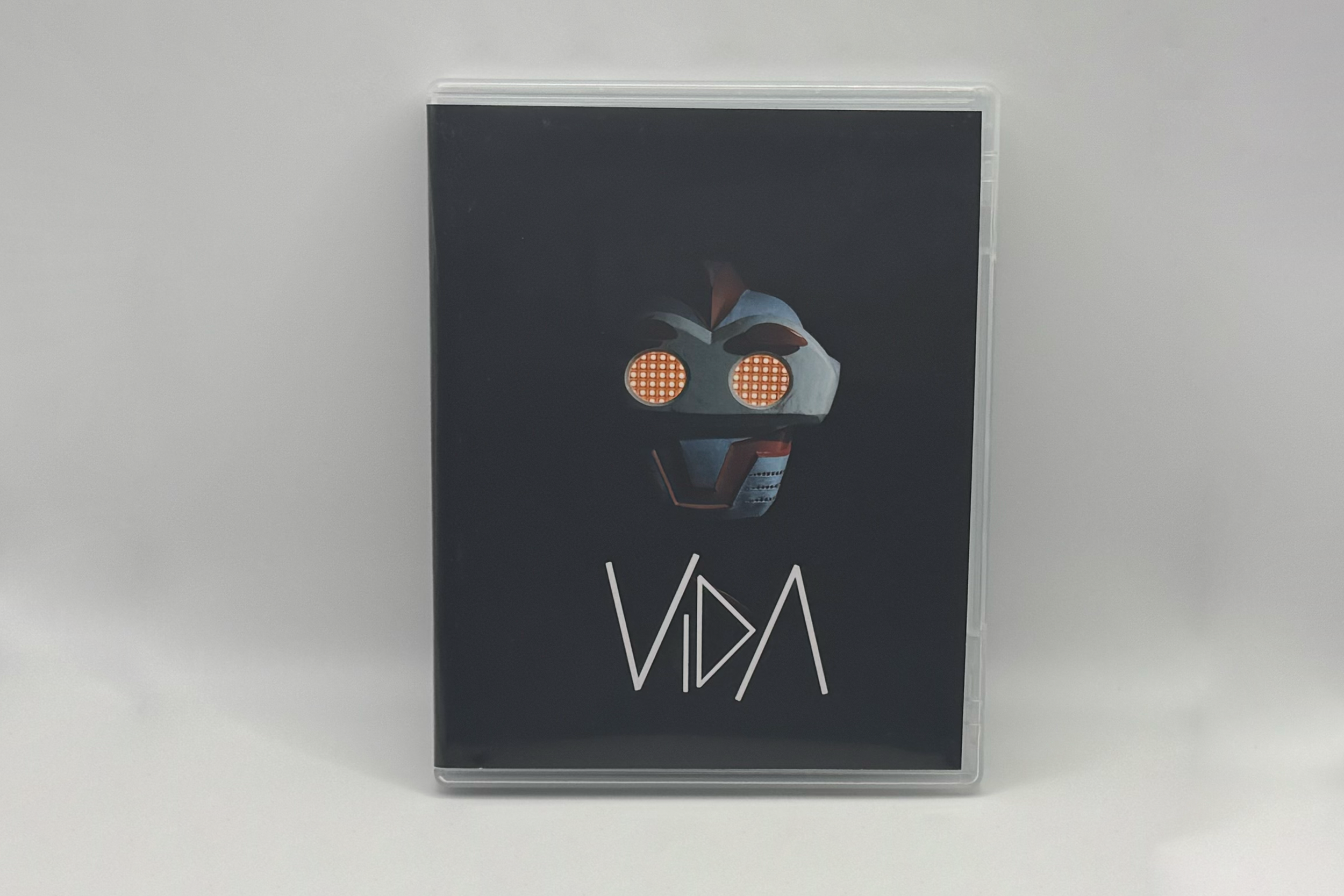
Once VIDA was completed in mid-August, work began on the Blu-Ray release of the film. The final product serves as a time capsule for the project, with over 2 hours of supplementary material and a 40 page booklet; a lot of love went into this plastic box. It was always something I knew I wanted to make as the final step in the completion of this VIDA saga, and will hopefully become the first of many Kinorama Pictures presented through physical media.
We only produced 200 copies of this Blu-Ray edition, and after giving copies to our film’s patrons and selling over a hundred copies online and at screenings, there’s only a handful remaining, which are available to purchase here. I’m not expecting to print any more of these, so once they’re gone they’re gone.
*Less than 50 copies left. All sales fund Film Festival submission fees.
About The Picture
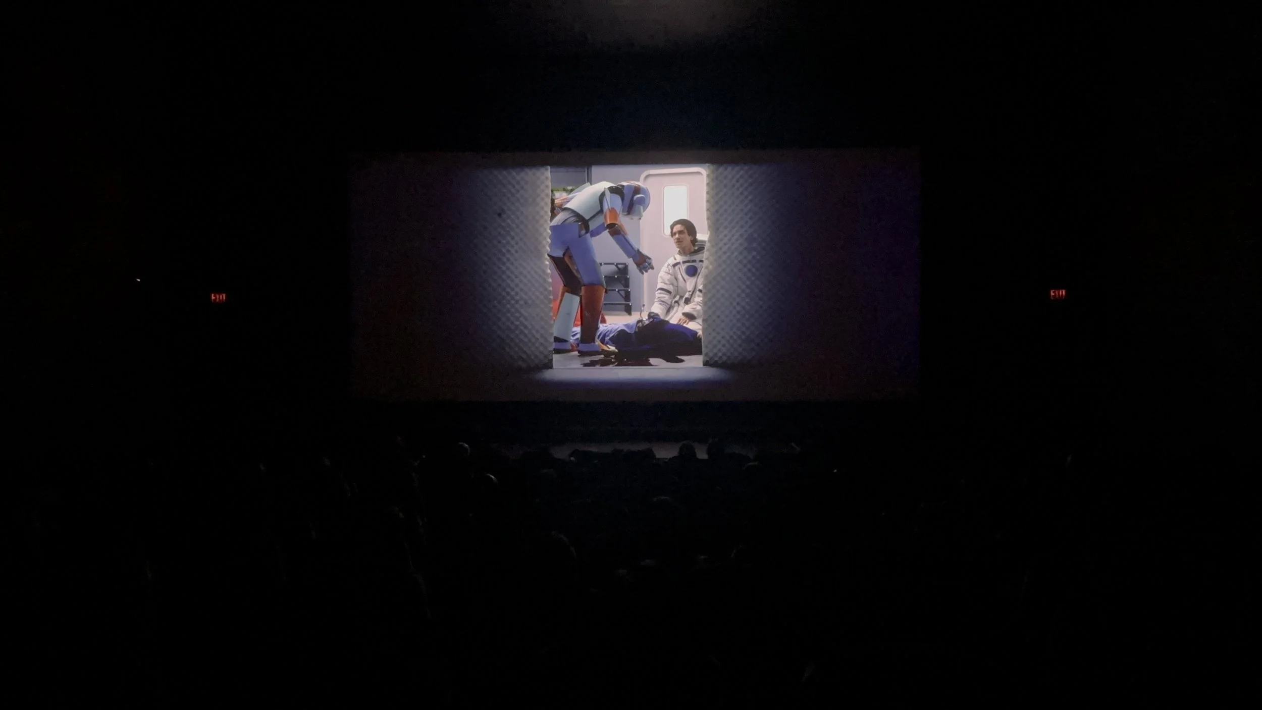
VIDA is a 15 minute science fiction short film that follows a servant robot who must overcome its feelings of imperfection and adapt to free will after being bestowed consciousness by its loving creators. This is a project 2 years in the making and made with the support of Chapman University.
The VIDA Blu-Ray Package contains the following:
Premium Blu-Ray box featuring VIDA artwork.
Blu-Ray Disc containing the 15 minute short film and 2+ hours of supplements.
40 page booklet containing essays from the crew, the full script, behind the scenes pictures, and disc contents.
Supplements Include:
Photo Gallery containing 100+ pictures.
Video Commentary: A casual commentary with Louis Schwartz (Director), Grant Chauncey (Writer) and Matias Montemayor (Producer).
Seed & Spark Crowdfunding Project Video.
The ‘Dodge Cut’: as shown in April at Dodge’s screening, this cut excludes scenes shot at the Rainbow Basin desert.
Dodge Speeches: Given during the ‘Dodge Cut’ premiere, including Grant‘s infamous 8-minute monologue.
The Set Construction: Over half an hour of footage taken from the days leading up to principal photography.
Filming the Death Scene: Over half an hour of footage from our 5th day of filming when we shot the climactic death scene.
Building The Robot Suit: 20+ minutes of vlogs recorded by Chloe Leis (VIDA suit designer & physical actor) chronicling her building process.
Synthesizing VIDA: Checo (Composer) plays with some synths and shows what went into creating VIDA’s score.
The Foley of VIDA: Ryan Lew (Sound Designer) shows us some of the foley recorded during the sound designing process.
The On-Set TikTok’s: short form videos taken during the filming of VIDA.


Exciting Plans
We have some exiting productions in the works, including a new music video from Checo Cadena, titled Doomscroller (to follow up on 2023’s Take Your Time) which we filmed last month and are currently in post-production for.
There is another short film in development, which I am extremely excited about, but it’s still too early to talk about that. And some bigger projects, which I also can’t talk much about, will take several years to come to fruition. Things are moving, and the foundation of Kinorama is being mapped out.
Refining our Logo
A big part of our first year was crafting the Kinorama logo, which I detailed in last-years anniversary post. Since then, we’ve updated the logo slightly, and streamlined it a bit. We decided to remove and the inner details in the logo and instead stick with the simple silhouette of the Kinorama projector in a single color. The focus on the shape will make the logo less busy when presented in places like favicons, profile pictures, and physical media spines. We also narrowed the projector’s base, which emphasizes the ‘K’ and makes the shape of the logo more powerful. So not a huge update, but just some good refinement.